In the ever-changing Canadian design market, adaptability is a key factor in the colour trends for 2017. When talking paint, our experts have mixed opinions on the 2017 trends. What they all have in common is their ability to brighten or deepen any room in the house. This range of colour options caters to a wider demographic, given their timeless charm, catering to both young and old at heart.
Take a look at some of the 2017 colour forecasts that include purple, as described by our colour experts at Laurentide, Sico and Para brand paints.
Laurentide, Purple Hues All The Rage
One of the leading colours of trending palettes is violet, a shade well suited to office decoration as it stimulates the imagination and helps restore a sense of balance, says Janine May, colour expert for Laurentide. Laurentide Paint is a Canadian company offering a full range of paints, stains and varnishes with over 1050 trending colours in their palette.
This colour is certain to prove a hit with artists and individuals whose work entails an appreciable measure of inventiveness. A blend of red and blue, violet comes in a broad spectrum of hues. To create a soothing backdrop for your workspace, choose a softer shade like Parma violet. For an invitingly chic look and feel, envelop your space in a richer plum shade.
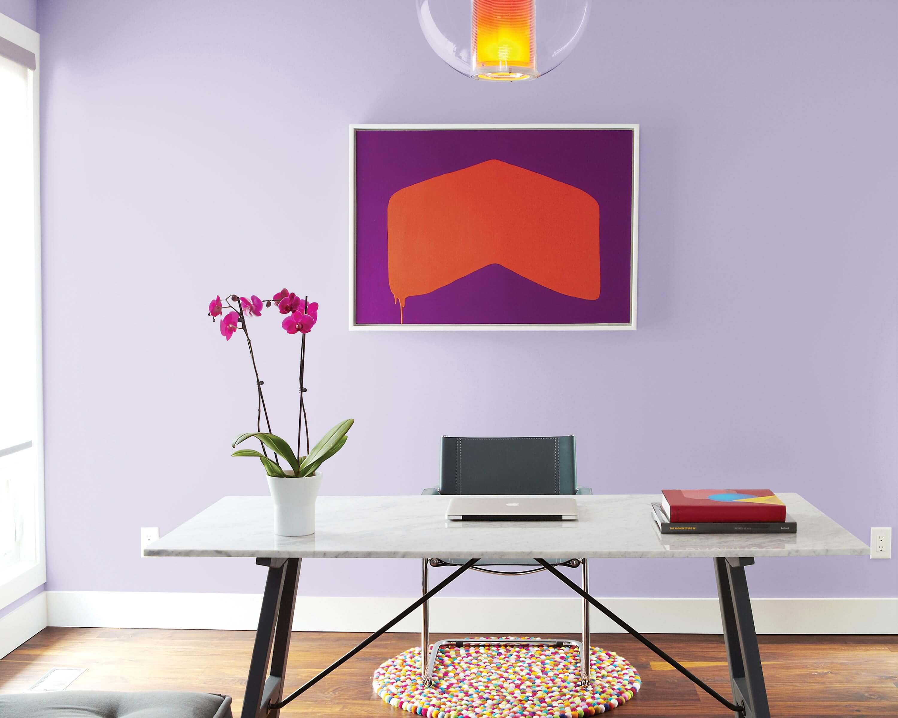
Laurentide Paint chose a superb lilac (Laurentide 3-41-3) as a feature colour, and then energized the space with splashes of electric violet (Laurentide 3-43-7) and bright orange (Laurentide 1-3-7).
SICO Paint, Paint for All Seasons
Topping the list of the Sico paint brand’s 2017 colours is purple, particularly shades of blue-grey violet – such as Mozart (6172-52), the brand’s Colour of the Year – that can be adapted to any room, gender and season, Paiement said. Describing the colour as rich and calming, she said the new purple is so versatile that it can be used on walls to infuse a living area with a luxurious feel or a bedroom with a soothing vibe. “Next year’s colour palette is more complex than we’ve seen in the last few years, with a mix of both charged and subdued tones, building on consumers’ growing willingness to try new things,” said Geneviève Paiement, Brand manager,Sico paint brand of PPG. Paiement explained. “Energetic brights sit next to muted midtones; classic reds and blues bump into mixed blue-greens and green-yellows; and clean colours join greyed ones. From wintery rich purple and slate, to spring-like nature-based midtones, to saturated summery lights, to autumnal reds, yellows and greens, the colours trending for 2017 are reflective of both the changing landscape and people’s increased desire for change and empowerment in today’s non-stop world,”
According to Paiement, other trending paint colours for the year ahead are divided by season. “Everyone has a favourite season, and by grouping 2017 colours according to time of year, fashion-minded consumers can capture the seasonal look that expresses their passion through their decor,” Paiement said.
Winter
Winter features slate and black, such as Basalt Grey (6208-63) slate and Black Ice (6207-83) black by Sico paint.
Spring
Spring offers earthy rich midtones, such as the Sico paint brand’s Taos Stone (6073-52) clay, Beechwood (6192-53) sand and New Jeans (6004-63) blue.
Summer
Summer shines with pale golden yellow, soft violet and white, such as Almond Biscotti (6115-42) yellow, Bright Sky (6176-31) mauve and Pure White by Sico paint.
Fall
Fall highlights leafy orange, terra cotta and olive green tones, such as the Sico paint brand’s Sun-dried (6087-84)
orange, Sockeye (6063-73) and Moldavite (6138-83) olive.
PARA, Two Trend Options
For the first time, PARA presents two leading colours for 2017, which deliver both tranquil and dramatic colour
options, yet are inspired by colours found in nature. These deep teal hues draw on a water world; they are nostalgic of mid-century modern style, while calling on today’s refined artisan movement that touts sophisticated techniques and a passion for nature.
Trend Number One – Twinkle in Her Eyes (P5163-34D)
This tranquil soft green-blue tone invites harmony and relaxation and creates a watery calm feeling in the home. When combined with whites and soft greys, it creates an illuminated and lighthearted atmosphere. This tranquil tone is soothing and spa-like, while acting like a chameleon, blending in and changing with the day’s light. No matter what your flooring colour, achieve a lighthearted comfortable space by coupling PARA’s Twinkle in Her Eyes with white trim, millwork and ceilings.
Trend Number Two – Enigmatic Triton (P5105-75)
This colour speaks to the creative soul, it is a mysterious green-teal tone, perfect for creating a sophisticated space. The enriching colour flawlessly sets the stage for elegance – ideal for a formal dining or living room or an accent wall. This deeply tinted ‘fashion’ teal is geared directly towards the designer or professional decorator. PARA’s Enigmatic Triton is boldly alluring and refines a space wherever used in a design. Capturing the essence of living with nature and the knowledge to design spaces with soul, this colour forms a deep-rooted connection between artisans and the new luxury of conscious consuming.

Photo courtesy of SICO