It’s that need for a “digital detox” that is driving home décor trends for the coming fall and winter season.
“Trends are ever-evolving and I think that’s part of the reason we have one story we’re all discussing at great lengths right now – and that’s our natural desire to have a quieter, calmer approach to life,” said Janine May, Colour Marketing Manager at Sherwin-Williams Diversified Brands Canada (General and Para Paint, Color Journeys and Minwax Canada). “That desire influences how we integrate colour and finishes into our living and working spaces.”
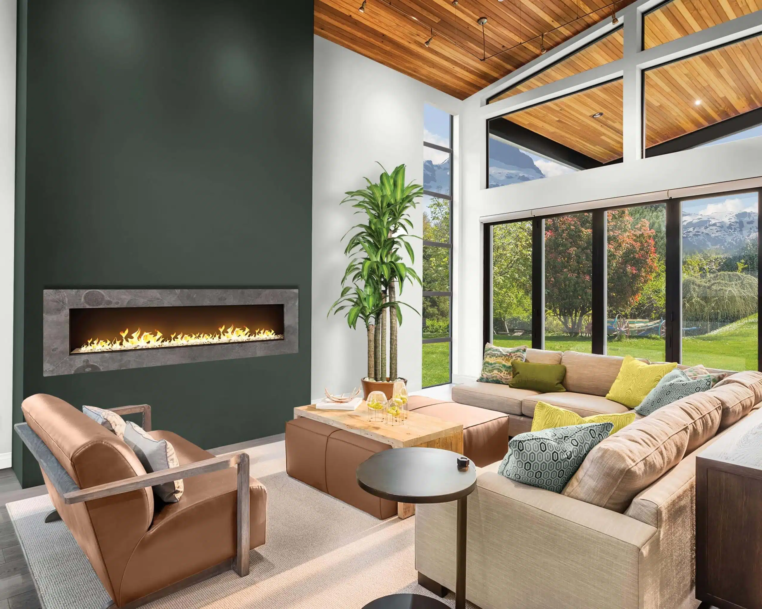
She said people are gravitating more to earthy-type themes. “Earthy prints and textiles like we saw last year aren’t going anywhere. It will morph and change a bit, but that particular theme of creating a getaway or an escape is more and more where the consumer’s mind is at.” She added that people are incorporating more elemental themes into their homes to evoke the comfort of the natural world.
“People are seeking solitude and refuge from technology and wood as a key material in design is really driving the trends right now”
“People are seeking solitude and refuge from technology and wood as a key material in design is really driving the trends right now,” continued May. “Besides the natural organic colours, like the greens, a few colours have come forward through different conversations we’ve had within the industry. One is Color Journeys Fig Cluster 302G. Imagine the colour of fresh figs on a natural wood surface, maybe a cutting board with cheese, mulled wine, that sort of comforting feeling.”
“We’re also observing red. There is a deep, deep red we’re all looking at right now called Mesa Red 340G, and it brings to mind holidays and celebrations. It’s a bit classic but just a bit different.”
May added that a Danish tradition called “hygge” is also figuring heavily into interior design these days. The concept revolves around the pursuit of cozy contentment and tapping into inner solitude, peace and joy.
“It’s almost a meditative process and revolves around that winter celebration,” she explained. “Those rich berry tones and mulled spice tones are popular, or the earthy greens and browns seen during a walk in the woods. We sort of speak to the senses that way – people want comfort and quiet; for us this means calm colours.”
Lastly, colour marketing teams are reporting that millennials love the colour black, and that is driving the trend of black fashions, finishes, and lighting fixtures.
“Black is kind of a staple. But it can never be just a dull flat back – there are blue blacks, green blacks,” said May. “We’ve got a colour called Tuxedo, a smoky dark black plum colour. It’s very elegant, very calm, and can be used in many applications. We noticed a lot of people were painting media walls or the back of a bookcase. It’s used purely as an accent colour.”
She said Color Journeys Canada by General Paints will likely announce its colour of the year for 2018 in mid-October.


Photos courtesy of PPG Paints
Sophisticated & Unexpected
Meanwhile, PPG Paints’ 2018 colour of the year has been dubbed Black Flame – a rich, dark black that is infused with navy undertones. According to the company website, the “sophisticated, unexpected neutral fulfills cravings for comfort, privacy and hope.”
Dominique Pepin, Associate Marketing Director for PPG Architectural Coatings Canada, said Black Flame would be a great choice for a bedroom where it can be offset with clean white and warm wood tones, accented with rich blacks and gold.
She added that PPG’s Delicate White remains popular for walls and trim.
“White is a great choice for kitchens to evoke fresh, clean vibes,” said Pepin. “It’s super versatile and makes any other colours in the room shine, too.”
Another popular PPG colour is Antique Silver, a mid-tone grey that brings warmth to any room and pairs with neutrals like Delicate White and Black Magic to add sophistication and flair.


Photos courtesy of PPG Paints

Photo courtesy of Rust-Oleum
Rough Around the Edges
If you’re not up for painting a whole room, how about giving that old dresser a facelift?
Chris Hatfield, National Sales Manager at Rust-Oleum Canada, said the company’s Chalked Ultra Matte paint line is popular with homeowners who are looking to distress their existing furniture to give it a more pastel, country flavour.
“This is a flat line of paint geared to antiquing, giving that country look,” he said. “Ultimately, it’s done really well for us in the last couple of years. We sell a lot of utilitarian type problem-solving products, but the chalk paint is one of our decorative products.”
He added that the Chalked product line is easy to apply – for one thing, it self-primes – and dries to a smooth matte finish that brings new life to tired and worn pieces. It can also be distressed to achieve a vintage look by roughing up the edges.
“There are other chalk paints out there that use wax finishes and multi-step programs,” said Hatfield. “For a do-it-yourselfer, ours is much easier. You apply it with a roller or brush and the product is water-based for easy clean-up. You do have to put a clear finish on top of it, because it’s a flat paint. If you don’t, you will get fingerprints.”
Rust-Oleum sells pre-mixed quarts of its most popular tints, including Serenity Blue, Country Grey, and Linen White. The company also sells chalk paint brushes as part of a complete program. These brushes are very fine so they don’t leave stroke marks, explained Hatfield.
The Chalked line is also manufactured in aerosol format so it can be applied to outdoor patio furniture or more intricate projects.
Hatfield said stains and varnishes are another way to warm up the indoor environment this fall. Homeowners can bring new life to wood floors and furniture through the Rust-Oleum Varathane line, which includes the new Ultimate Wood Stain.
“You can actually get your colour consistency in one application as opposed to two or three coats,” said Hatfield.
“We’ve come up with the highest quality pigments because the Joe do-it-yourselfer doesn’t like to go through too many steps.”
The stain comes in 13 modern colours and Hatfield reported that people are mostly looking for darker tones such as walnut. It dries in one hour and then an application of Varathane Triple Thick One Coat Clear Finish will complete the project.
With our digital world moving faster and faster, it’s no surprise that people are returning to more natural roots. Grounded in earthy colours and comforting materials like wood and stone, homeowners are creating their personal retreats where the world can slow down – if only for a little while.

