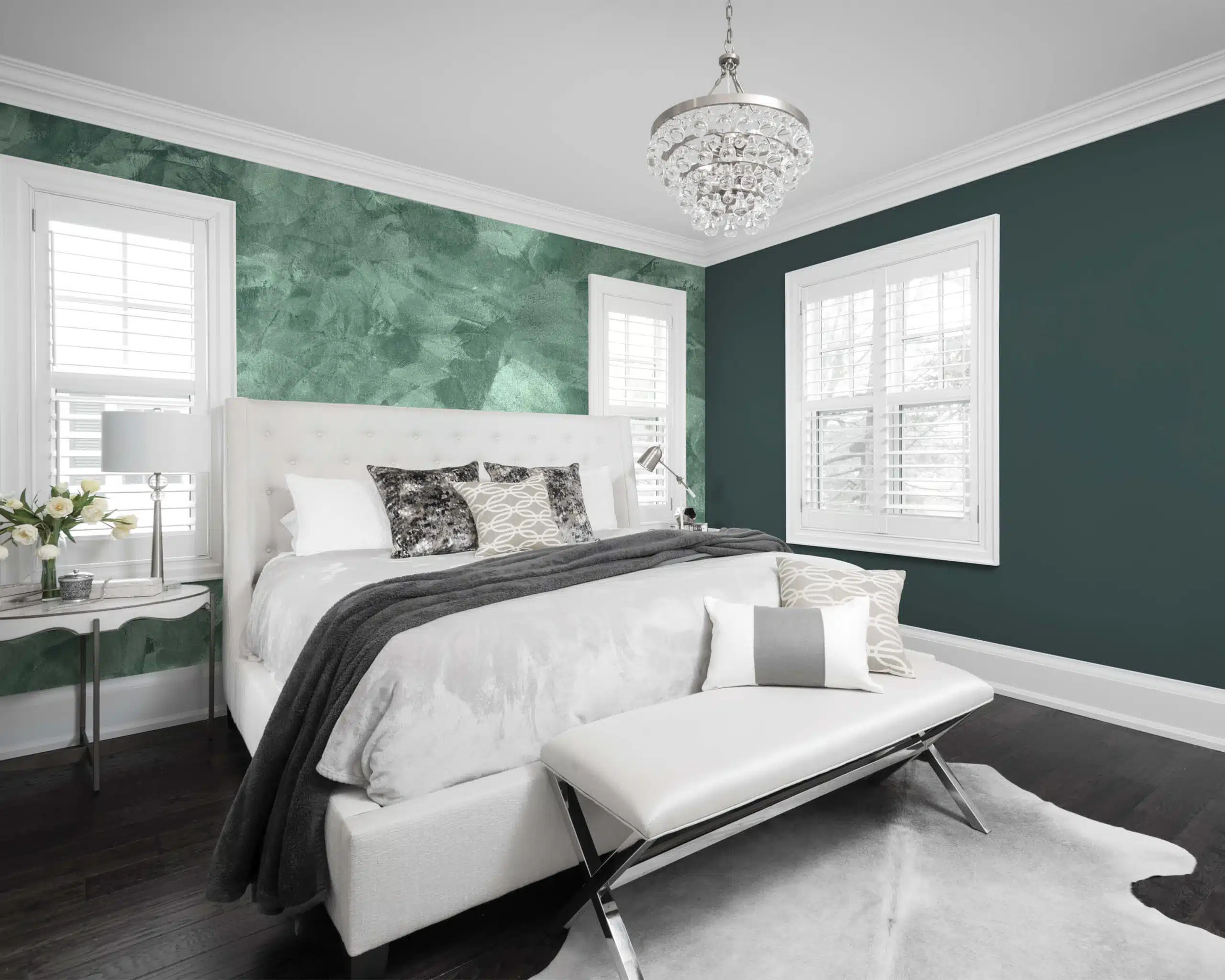
SOPHISTICATED GREENS—AND BEYOND
“Spring paint colours are no longer limited to soft pastels and creamy neutrals,” says Dee Schlotter, Senior Colour Marketing Manager for PPG Architectural Coatings. To bring all that spring greenery inside with a contemporary twist, there’s PPG’s 2019 Colour of the Year, Night Watch. It’s a deep and sophisticated green that Schlotter says can be used in a wide range of rooms. “It’s especially impactful in spaces that don’t have windows or views of the outdoors, such as the end of a windowless hallway.” It can be used as a neutral, she notes, yet has the intensity to also stand out as an accent col- our. Schlotter suggests pairing it with soft grey-browns or warm sandy beiges.
Darker colours continue to grow popular for homes’
exteriors, so Night Watch offers an alternative to the trend- ing deep blue-black and black shades. “Because colours from nature tend not to clash, Night Watch also blends perfectly with greenery or other landscaping,” says Schlotter.
PPG 2019 Key colours also suggest dramatic mustard yellows which is something of an ode to the sunshine of the season, and the company predicts we’ll see more and more strong yellows as the year goes on. “We recommend using this hue on a front door, as an accent wall in a bedroom or in a dining room to provide a rich, striking look,” says Schlotter. “Yellows are often too bold for use on all four walls, though, so use sparingly!”
PAINTING THE FULL PICTURE
It’s not just the colour choices on the wall either. Schlotter recommends using Night Watch with a statement piece, such as a chair or ottoman, to create a bold, lively space. Gold and brass accents also pair nicely with Night Watch, such as pulls on drawers, lamps or picture frames.
NATURE CALLS
Design that connects people back to nature is a significant trend right now—not just when it comes to paint colours but also with design in general. “It’s on the rise in senior living buildings, office spaces and multi-family developments,” says Schlotter. “Now,” she adds, “it’s finding its way into residential spaces as homeowners—particularly Millennials—are looking for ways to disconnect from technology and reconnect with nature in their homes.” Spring, of course, also brings with it a natural tendency start thinking about gardens and greenery.
Looking for another option other than going green, not to worry, Schlotter adds that “pink will continue to trend in the coming year, but will mature a bit.”

Photo courtesy of PPG Architectural Coatings
Photo courtesy of PPG Architectural Coatings

Photo courtesy of The Sherwin-Williams Company

Photo courtesy of The Sherwin-Williams Company
“This palette can be safe and relaxing or a bit daring with using Ginger Scent (a warm terra cotta, and PARA’s colour of the year), Hot Tamale or North Hampton,” says Belfall. There’s also a big trend right now of using strong statement colours on a ceiling. “If you decide to do this, make sure to paint your walls with off whites (he suggests PARA’s Favourite) to bring balance to your room,” says Belfall. “The Reserve Palette can be used in any room in the home, especially in bigger spaces including living rooms, kitchens and great rooms.”
Taking inspiration from natural hues of flowers and plants, PARA’s Fulfill line brings garden hues indoors.
BALANCING ACT
At EVOPaint, there’s a similar trend emerging for the season. “We’ve identified three themes for this spring: Exploration, Bright and Subtle,” says Tony Margani, Executive VP Sales and Marketing with Wheelhouse Coatings (makers of EVOpaint).
While they might sound contradictory, they work together, much like a balance in nature. “Exploration satisfies the move to invigorate our rooms after a long winter and this is complimented with natural bright colors,” says Margani. “But too much intensity can overwhelm,” he cautions. So, the colour group is rounded out with shades that are more subtle and that work to add calm to the richness.
When using them in a home, he suggests transition areas like hallways and staircases do well with the subtle shades that lead into common areas like family rooms, where home- owners can then let loose with the more exciting, fresh tones of the season.
RESET AND REFRESH
Much like gardens, a room dressed for spring this season can reflect anything natural: from shades-of-green Zen zone to a bright floral-hued space. With just a dose of inspiration and a little paint, homewoners can shake off the winter months and freshen up their spaces for the warmer, brighter months ahead.—
