Hence why this year, the main focus of interior design for the home is centred on creating a calm, cozy atmosphere. While homeowners may do so by adding a few accessories here and there, another great option to consider, that is both easy and economical, is a change in paint colour.
Scandinavian Way of Life
Colour trends are based on a number of factors. Gary Belfall, Marketing Brand Manager for Para Paints, explains, “Various things influence colour trends. For example, what is going on in the world, people’s moods, current ideologies; one big influence for this year is, Scandinavian design.”
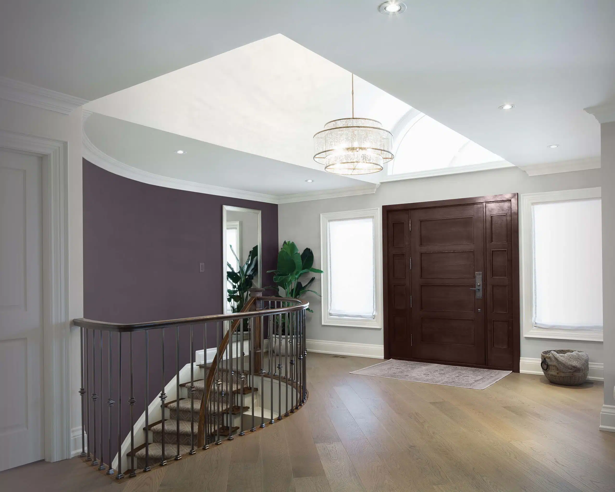
Known for its simplicity and minimalism, Scandinavian design evokes modern neutrals, which is exactly what the 2018 Para Paint Serenity Palette reflects. These colour choices, selected by Para’s Colour Journey designers specializing in design and fashion, include tones such as, delicate lavender-infused Glamour (405 A) and darker slate stone Malachite (405 E); such colours strike a sense of “calm, cool, sophisticated serenity” rendering any room in one’s home inviting and appealing. “Our goal was to choose colours for our palette that are both calming and liveable to give your home a sense of inspirational design,” explains Belfall. In turn , this design trend nods to the Scandinavian ideology of, “Hygee,” a concept involving feelings of coziness, comfort and contentment.

Touch of Luxury
Scandinavian design may be minimalistic but with that simplicity comes a sense of luxury. As Belfall states, “You don’t need many things in your home to have a luxurious design or feel.”
This design rule extends to colour choices, as well. The 2018 Para Serenity Palette suggests using neutral, minimalistic tones such as whites and soft pastels as the foundation of a room, and then adding in that touch of opulence through customized wood stains and deeper jewel tones.
“The way to implement colour into a room – especially with the Scandinavian design minimalist approach – is to balance it with cool whites or off white tones,” explains Belfall. “Many of the colour choices in the palette are dark, so you don’t want to do the whole room that colour as it may close it off; thus, you balance it with opposite whites or lighter version of that colour.”
Sico paint brand by PPG is also embracing the darker tones this year, and suggests adding a touch of elegance through their 2018 Colour of the Year – Cast Iron (6173-83). As Mylène Gévry, Senior Marketing Manager for Sico states, “This colour is hard to ignore and provides a certain grandeur or simplicity to a space because of its flexibility.”
Misty Yeomans, Colour Marketing Manager for Sico, adds, “It brings solace and a peacefulness to any space, creating a haven in which to retreat from our always-connected, high-pressure society. It’s versatility in pairing with other colours adds to it’s allure in home decorating.”
This colour, which was unanimously selected by PPG’s more than 20 global colour stylists, can be combined with bolder colours like Sico’s dark burgundy hue, Venetian Wine (6082-85), or contrasted with lighter tones like off-white, Ground Coriander (6218-21). As a further suggestion for that touch of elegance and luxury, the brand promotes combining this colour palette with brass or gold accents.
Coordinating it All
Selecting colours for one’s home is not easy – especially with today’s modern architecture. “Now more than ever, individuals are having a hard time choosing colours for their home due to open concept designs,” explains Belfall. “This is why we come up with a sub-palette of colours within each trend palette,” he continues. “This provides a subset of colours that people can choose from as they all tonally match.”
However, floor plans are not the only thing one should consider when trying to scale down colour choices.
Instead, one should also analyze aspects such as lighting, appliances, and window coverings when choosing paint colours for one’s home interior.
For example, Gévry points out that, “Sico Paint’s Cast Iron colour perfectly complements the various trending black building materials and home accessories [currently seen] in the marketplace.”
Lastly, if you’re not sure how to offset contrasting colours in a space, including those of wood finishings, one way to do so is through the art of colour blocking. According to High Point Market Style Spotter, Bria Hammel, as stated in the Summer/Fall 2018 Style Report, colour blocking has ranked as a major trend over the last five years. “This year, we see it…expressed in pastel stories, subtle patterns and on more traditional frames.” This is an especially big trend for wall design, but also, when juxtaposing kitchen cabinetry with counter finishes.
Creating a serene retreat from the cool fall weather and busyness of everyday, has never been easier. With so many paint colours and design styles to choose from, it’s simply a matter of choice in how one would like to design their home sanctuary. 