As the year draws to a close, paints and coatings manufacturers are clocking a shift from 2025’s vibrant and expressive colours to a more earthy, natural palette for 2026.
“Grounded shades, inspired by materials like wood and leather, provide a practical foundation that pairs well with a wide range of palettes,” said Trevor Maximuk, Director of Sales & Corporate Dealer Development at Cloverdale Paint Inc., a Canadian coatings company founded in 1933 in Langley, B.C.
He added that warm brown tones are becoming prominent in both residential and commercial markets, where a “focus on authenticity, long-term usability and spaces that feel approachable is trending.”
Tones that evoke such elements as earth, stone and foliage will become more popular in 2026, predicted Maximuk.
Paint colour popularity is shaped by a mix of cultural, design and lifestyle influences, he explained. One of the strongest drivers comes from textiles, like fabrics and wallpapers, and flooring materials—and paint will naturally follow these trends to complete the look. Fashion also plays a critical role. Ultimately, paint colours gain popularity when they align with the textures, materials and fashions that people are already embracing.
“Consumers are searching for products that are easy to apply and provide strong durability,” said Maximuk. “Low VOC formulations are important; however, value and longevity have become more sought-after characteristics.”
Recently, Cloverdale released its Guardian Plus Anti-Scuff acrylic interior enamel to the market, which has quickly become one of its most desirable lines.
“Anti-Scuff technology offers extraordinary durability, impeccable washability and unmatched scuff resistance. This 100 per cent acrylic paint provides maximum protection, while being delivered in a low VOC formulation.”


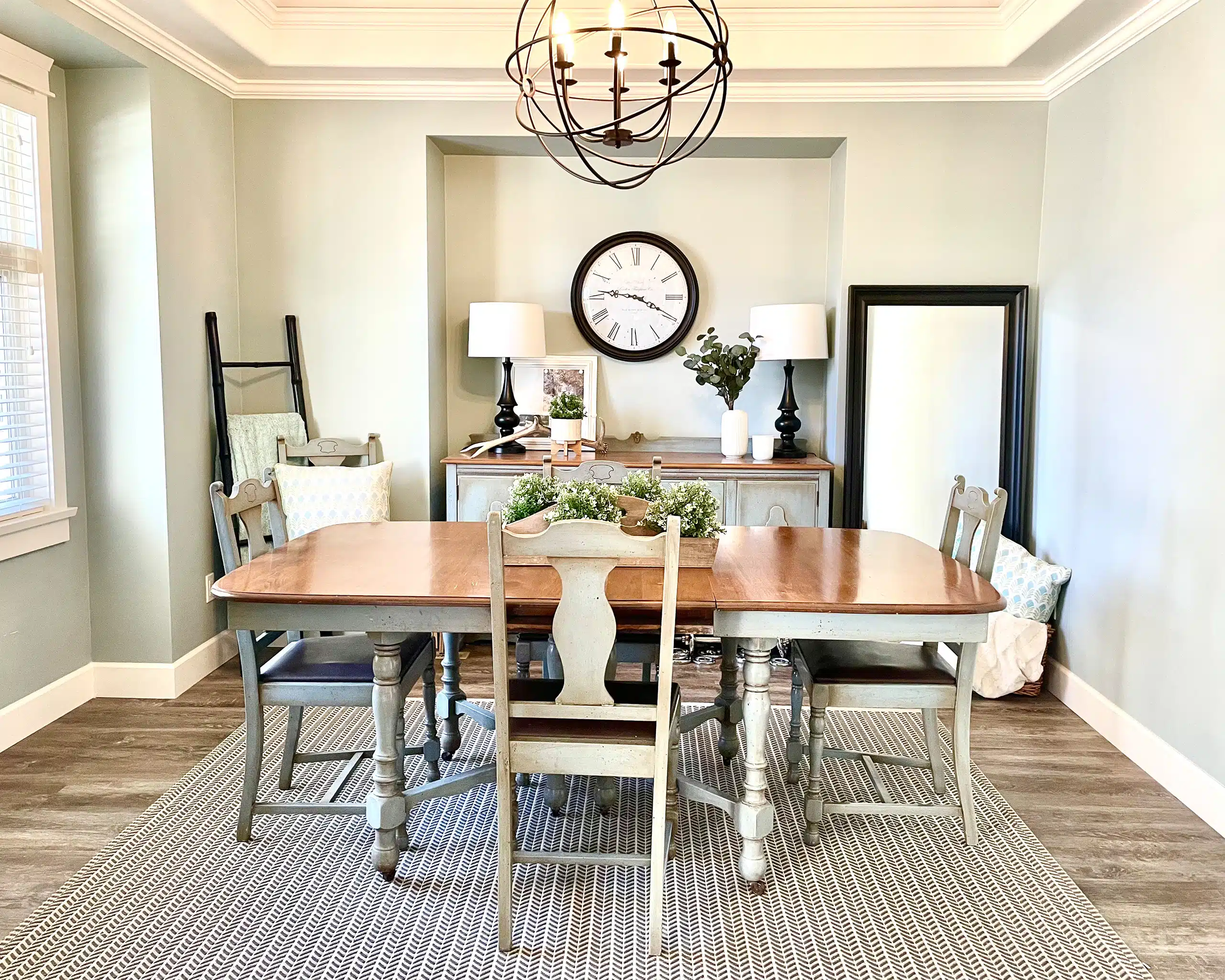
Photos courtesy of Cloverdale Paint Inc.
Maximuk sees the 2026 Canadian paint and coatings market being shaped by numerous factors, including “environmental regulation, rising demand for sustainable products, and innovation driven by performance and weather durability.”
He believes the demand for housing, home renovations and government incentives for green building will likely result in steady growth in the architectural coatings sector. Although colour will remain a major factor, he feels consumers, homeowners, architects and builders will increasingly choose paints for their overall performance, service life and environmental impact.
Maximuk concluded with a positive observation about the paint and coatings market in the wake of international trade tensions: “As we are a Canadian family-owned company, we have certainly seen an increase in support from across the country.”
Warm and comforting
Over at The Sherwin-Williams Company, paint colours are also trending more toward green, earthy tones. The 2026 colours of the year are Sage Slate, Surrender and Warm Eucalyptus, reported Andrew Garrison, Sales Manager – Eastern Canada, who has spent 14 years in sales for the Valspar brand (acquired by Sherwin-Williams in 2017). Indoors and outdoors, consumers will be attracted to natural, restorative colours and grounded neutral shades, he predicted.
When it comes to interior stains, Garrison noted the Minwax colour of the year for 2026 is Special Walnut, a warmer, darker tone. “We are seeing a totally different trend shift for 2026; our previous colour of the year was more of a violet.”
Meanwhile, Coffee Bean—a deep, earthy, dark brown—will headline the Krylon spray paint line.
“It’s gone from bold blues and violets, to very neutral tones of browns and greens for 2026,” noted Garrison.
He also reported that two new exterior stain programs, Valspar exterior stain and Cabot heat-reducing stain, will officially launch in 2026.
Garrison feels recent changes in colour trends may be influenced by today’s economic uncertainty.
“That neutral, calm, settled feel of ‘I’m at home, I’m at ease, and not dealing with all the stress around me’—that’s more apt to happen when people feel more restricted with their spending,” he explained. When economic times are more stable, he sees colour trends leaning toward more bold and vibrant hues.
Colours move in cycles, not unlike fashions or home styling, he added, noting a strong shift from cool-toned, minimalist spaces to warm, organic, lived-in spaces. For consumers, colour continues to be a big driver—and they often have an idea of what they like before walking into a store.
However, “quality, durability and value are important, and those are somewhat derived from stain-blocking ability, washability and scrub resistance.”
Price will always be a factor in a consumer decision, but Garrison warned against choosing a paint product based on price alone. “Using a higher quality paint means you are more likely to get tired of the colour before the paint starts to wear down.”
For those looking to follow the current trend by moving away from greys and vibrant shades, paints that will cover a wall with as few coats as possible will be appealing. While Garrison recommended a primer for drastic colour changes, he declared that “exceptional hide” typically means it will be effective at hiding a previously painted surface. While recognizing that painting takes some time due to the prep work, application and reassembly of the room, Garrison advised that “a high-quality paint can get the results in one or two coats, and can reduce the overall time spent on that project.”


Photos courtesy of Sherwin-Williams
A refined neutral palette
Barbara Collet, Sales Coordinator at Société Laurentide Inc., sees cooler interior beiges being replaced by warmer tones inspired by sand, clay, wheat and raw linen. Adding rich evergreen, eucalyptus and moss tones will bring calming and grounding energy indoors, she said, while dusky blues and teals with muted mid-tones are gaining strength. Earthy reds and terracotta shades are returning as accent walls and decor pairings, adding warmth and depth to neutral spaces.
Collet announced that Laurentide introduced two new recycled paint products to the Canadian market in 2025.
“These two products helped launch the Boomerang Plus+ line within the Boomerang family of products, while maintaining our commitment to sustainability,” she said.
In the spring, Laurentide launched Boomerang Plus+ Tint Base Recycled Paint.
In the summer, it expanded its lineup with the addition of Boomerang Plus+ Kitchen and Bath Recycled Paint.
“Moonlight White, a warm white, blends beautifully with kitchen and bathroom renovation projects; this type of white should continue to be highly popular in 2026,” she said.
Collet explained that each year, Natural Color System (NCS) collaborates with specialists worldwide to define the major chromatic trends.
“Our colour inspirations are based on the international NCS Colour reference, a company with more than 80 years of expertise.”
For 2026, the “Quietude” collection highlights a refined palette of neutrals, she added.
When it comes to exterior paints and stains, Collett said, “Our exterior selection remains faithful to classic tones, reflecting the stable nature of this market where trends evolve more slowly.” She sees dark exteriors remaining strong, with undertones shifting toward charcoal, espresso and near-black browns. Olive and sage greens are perfect for blending with outdoor surroundings. Transparent or semi-transparent stains that highlight the natural grain of wood are in demand, she continued, while subtle off-whites or sandy undertones are popular for coastal or modern rustic looks.
“The cold greys of the 2010s have almost disappeared, being replaced by warmer, more organic alternatives. Bright primary reds, blues and yellows are less anticipated in living spaces, where softer, layered palettes feel more comforting and modern.”
Many factors drive colour popularity, added Collet, including sustainability and nature, well-being and emotional balance, economic and social climate, fashion and lifestyle influence, and technology.
“In 2026, green will stand out as the must-have shade,” she predicted. “Our Evergreen and Lichen colours will be consumers’ source of inspiration.”
Finally, for 2026, Collet said one of the company’s most exciting initiatives will be the relaunch of the Laurentide brand, which will “combine our legacy of quality with a renewed focus on high-performing paint.”
Colour that tells a story
Oriana Gagnon Martinez, Marketing Manager for The Pittsburgh Paint Company (PPG), said CIL® and SICO® offer a wide range of high-quality interior and exterior paints and stains. Depending on their needs, consumers will be looking for everything from durable finishes for high-traffic areas to fade-resistant exterior paints that withstand Canada’s diverse climate.
“Our commitment to innovation, sustainability and local manufacturing ensures that every can of paint delivers lasting colour Canadians can be proud of,” said Gagnon Martinez.
This fall, Canadians are embracing rich, grounded hues that reflect a desire for warmth, comfort and connection to nature.
“Deep mauves, like our 2025 Colour of the Year, Starry Night, and dusty pinks continue to add sophistication and softness to interiors,” she said. Rich greens and earthy neutrals are favourites among consumers looking to create a calm and timeless atmosphere.
With 2026 fast approaching, PPG introduced its first Canadian Colour of the Year: Boreal Forest, a deep, balanced green which Gagnon Martinez said was inspired by Canadian landscapes.
“We assembled a panel of colour and design experts from all over the country to help us pick a colour that truly resonates with Canadians.” She feels the colour adds a sense of serenity indoors and harmonizes beautifully with natural materials like wood, linen and stone. If used outdoors, deep greens will pair effortlessly with classic architectural elements and neutral trim colours, she added.
Complementary fall tones include Siennese Brown, a rich, clay-inspired shade that bring warmth and depth, and Van Gogh’s Wheatfield, a golden hue that add vibrancy and contrast to more grounded palettes.
“Together, these colours capture the essence of Canadian autumn: cozy, sophisticated and deeply connected to the land,” she explained.
For exterior stains, natural and wood-inspired finishes move towards warmer, organic tones that highlight the wood grain rather than conceal it. Rich wood shades like Cedar, Driftwood, and Walnut Brown will continue to be top picks for decks and siding. Those looking for a more modern, coastal feel can opt for lighter stains, said Gagnon Martinez. “These tones pair beautifully with deep green or charcoal accents, creating cohesive outdoor spaces that feel both contemporary and inviting.”
Colour popularity is shaped by a combination of cultural influences, emotional needs and lifestyle shifts. Gagnon Martinez feels Canadians are increasingly looking for colours that bring comfort and reflect their own connection to nature. Other factors impact how consumers want their spaces to feel—whether it be calming, uplifting or energizing. “Broader design and fashion trends also play a role, as do global events.”
She concluded by noting that in recent years, there has been a move toward earthy, restorative hues that promote balance and mindfulness. Expressive accent colours are being used to help consumers showcase their individuality.
“Ultimately, popular colours resonate because they tell a story about how we live, what inspires us and the mood we want to create in our homes,” she concluded.
As we head into 2026, consumers searching for design inspiration need look no further than out their windows, where warm, earthy tones are setting the stage for a very grounded year to come. —